
Last week in San Diego, I tried to sit down and finally tackle gift wrap, something that's been on my list for years! The goal was to convert our very popular holiday card, Fleece Navidad, onto gift wrap.
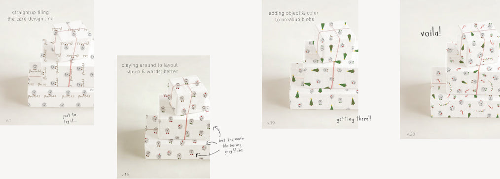
The easiest option was to tile the card design, which I knew wouldn't look great but I just wanted to see it:
^ It actually wasn't as bad as I thought it would be, but I don't personally think I'd buy this wrapping paper, which is always my baseline standard for myself.
Then I started playing around with various ways to interpret the card design. They were all very fast "no"s, but designs are always ugly before you get it right!
^ I didn't even bother mocking them on the boxes... They were all this bad.
After a lot of playing around, I finally landed on something I was very happy with!
...but after taking a break and looking at it again, plus Jeff's very helpful feedback, I was into the sheep/words placement, but it was too plain- the pattern blurred together because green and red are so hidden in the pattern and its just big blobs of grey.
So I added another object, trees:

^ Better! More variety, but then it just switched from blobs of green to blobs of grey.
I thought: What else can I introduce into the pattern to diversify?

^ Waaaay better. Colors are broken up into a nice pattern. Could maybe space them out more- seems a bit crowded, but overall so much more eye-catching than blobs of grey!
Then I wanted to experiment: Is it better if "Fleece Navidad" is easier to read and not hidden behind the design?
Does it make the sheep more obvious? Is that a good thing? It's cleaner, but seems more block-y and hard to draw the eye across the pattern.
How could I break up the pattern a bit?
Changed some of the candy canes to yellow, which makes it less block-y: more diversity of color.
Took a couple days break to re-assess, and I decided that I actually did like the subtle script. I'll have to see how it looks on print (will probably take a couple rounds of adjusting how light it is..), though, because I'd imagine it may feel very different than this mock.
Then I took an hour meticulously adjusting spacing, etc:
Excited to sell these next holiday season! Hope this process was interesting :)

